Dynamically show/hide elements in Adaptive Cards
Nov 7, 2024 • 3 • 489
Table of contents
It took me hours to figure this out, so here’s to saving you time!
After spending hours trying to figure this out, I figured it’s time to write it down. Hopefully, this post will save you some time and frustration, so you don’t have to go through the same process I did!
Designing an Adaptive Card
Designing an Adaptive Card using the Adaptive Cards Designer is surprisingly easy. You can create interactive cards with just a few clicks!
Making Elements Conditional
Now, here’s the tricky part I spent way too long trying to figure out: conditional visibility for elements. Adaptive Cards support the Action.ToggleVisibility action, but this only works tied to a button. In simple terms, the user decides what should be shown or hidden by clicking on the button.
But what if you want to show or hide elements based on a variable value, without requiring the user to manually click something? That’s when according to the documentation the magic of the “Only show when” property comes in.
Let’s walk through an example
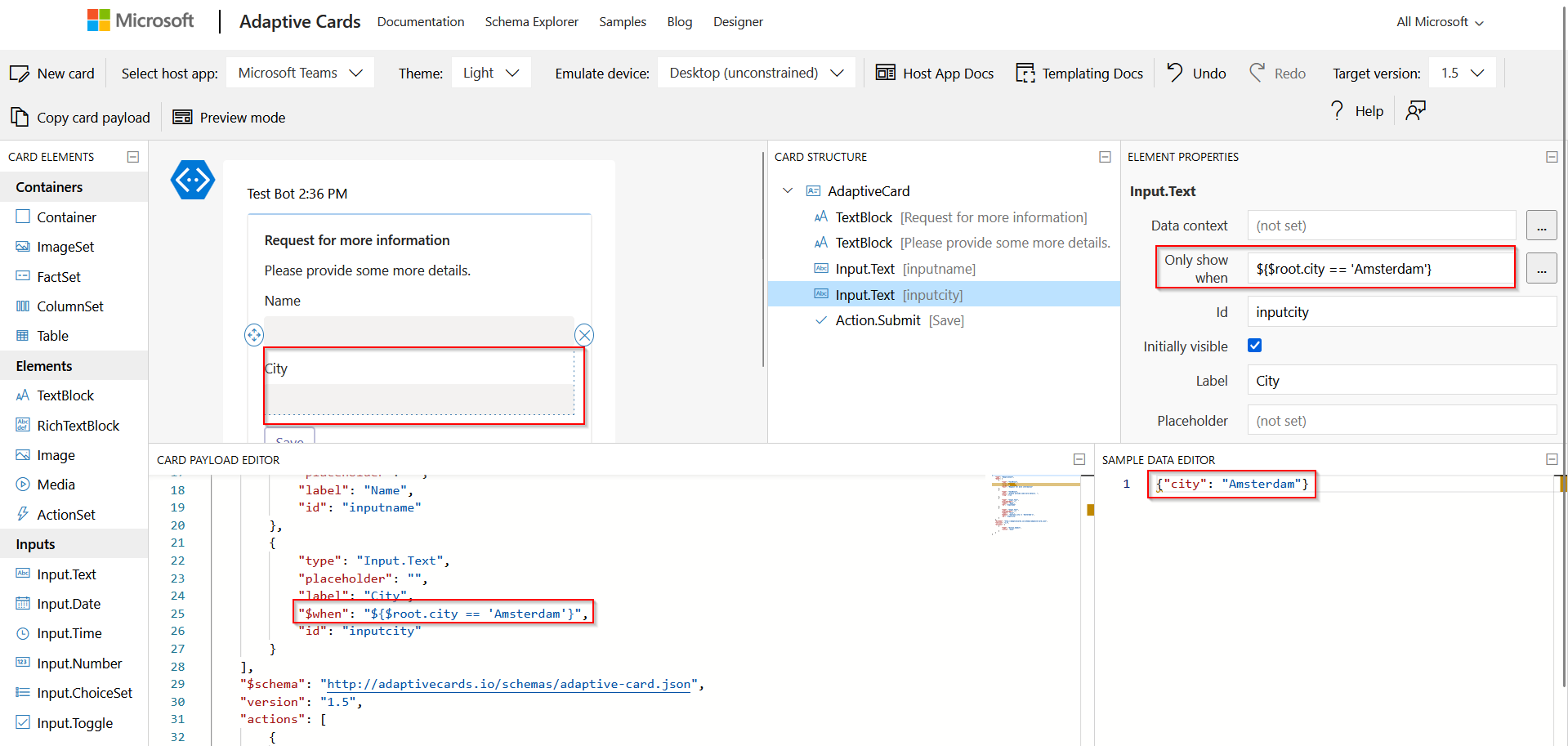
For this blog post, let’s design a small Adaptive Card where the user is asked for some input. Based on the city value the visibility of the Input.Text field for the city will be visible or hidden.
The settings of the ‘Only show when’ parameter.
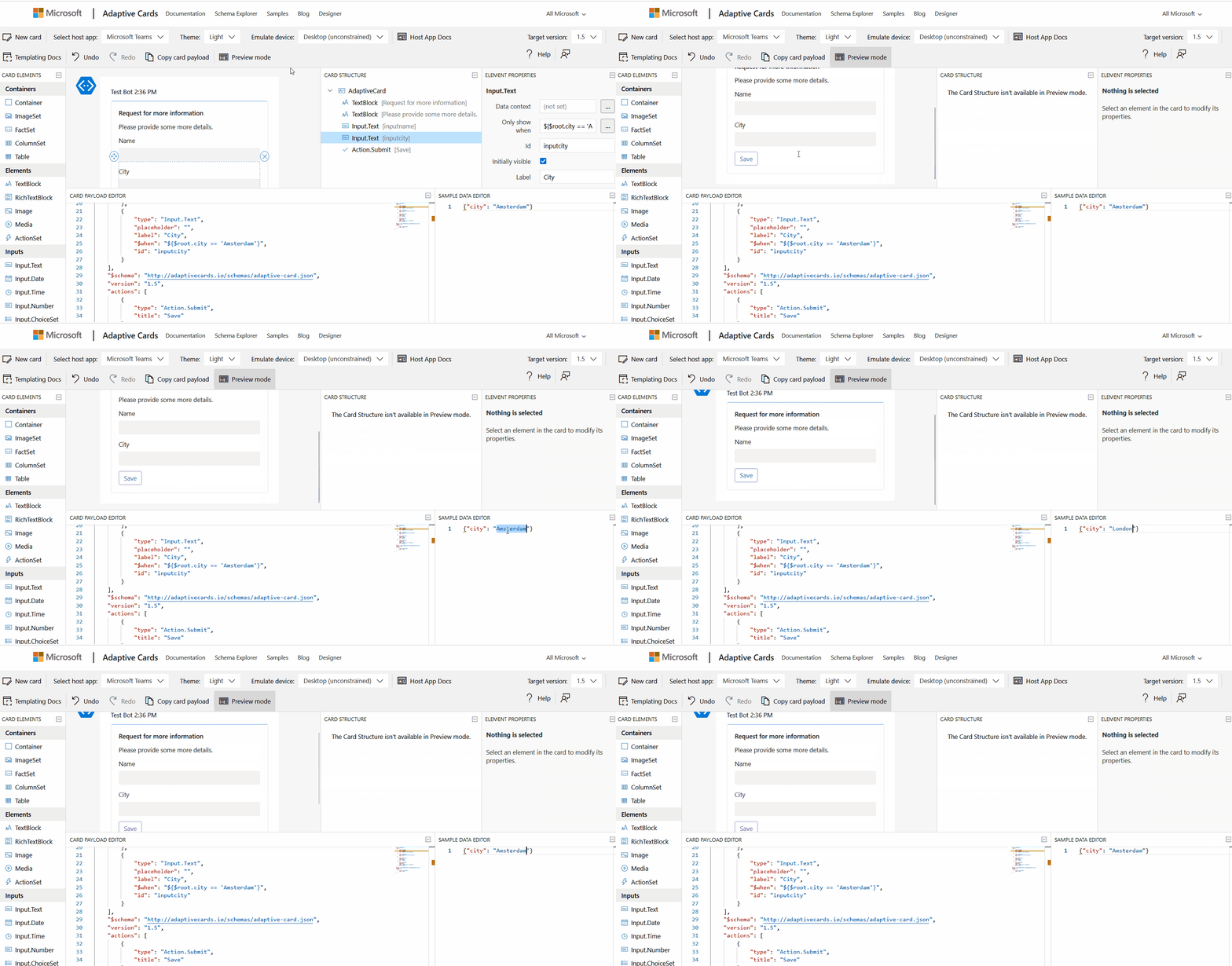
In the preview mode, it works perfectly:
Adding this ‘when’ statement in a Flow doesn’t work. I tried a lot of different ways to make it dynamically, but that didn’t work as expected.
Visibility
The trick is the ‘isVisibility’ parameter. In the designer the parameter disappears when deselect the ‘initially visible’.
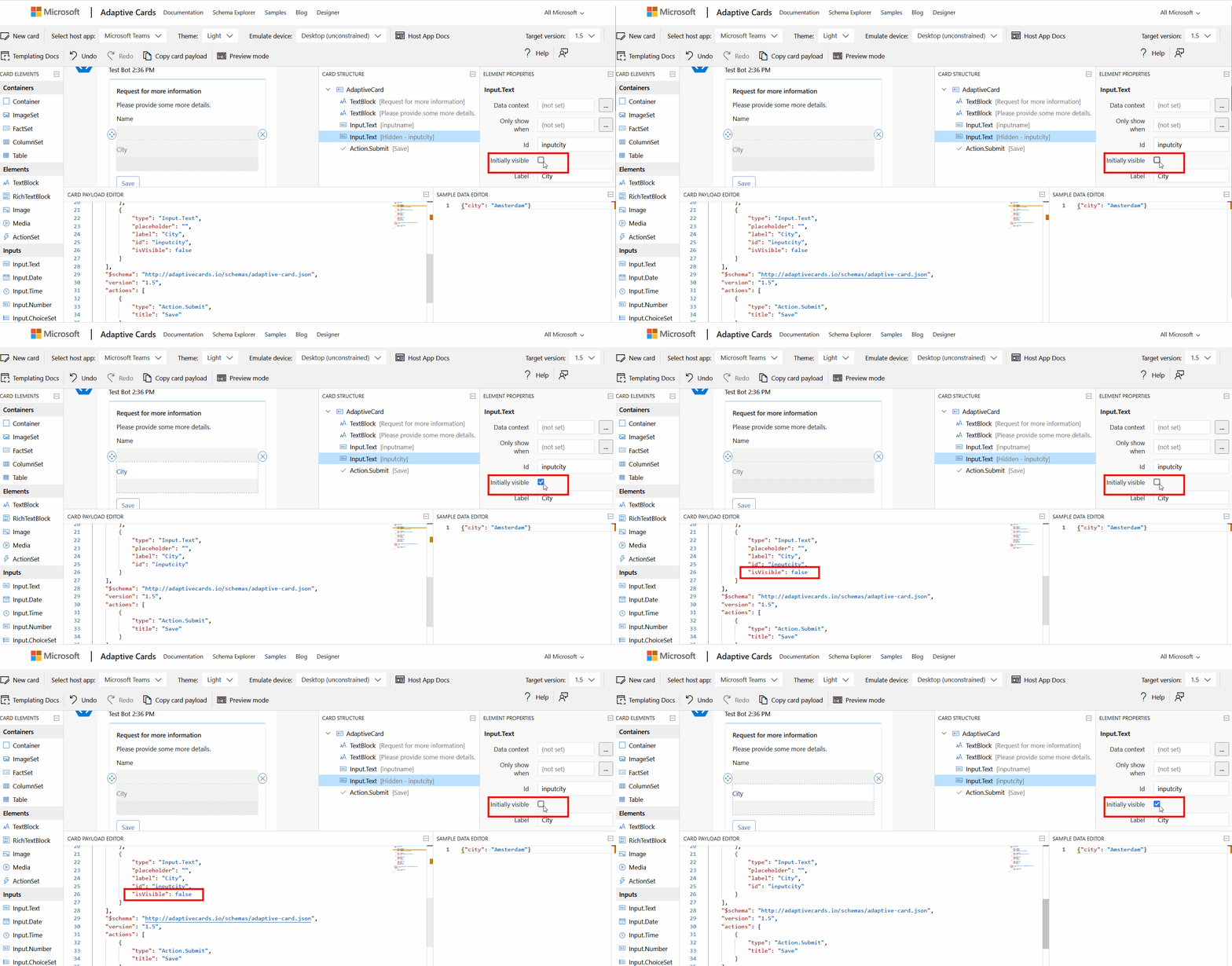
For the adaptive card in Power Automate, leave the ‘isVisible’ parameter visible.
Power Automate - Post an adaptive card
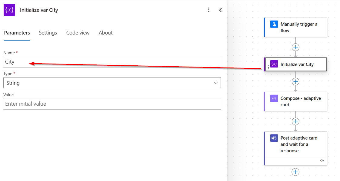
Create a variable of which you want to use as the dynamic value.
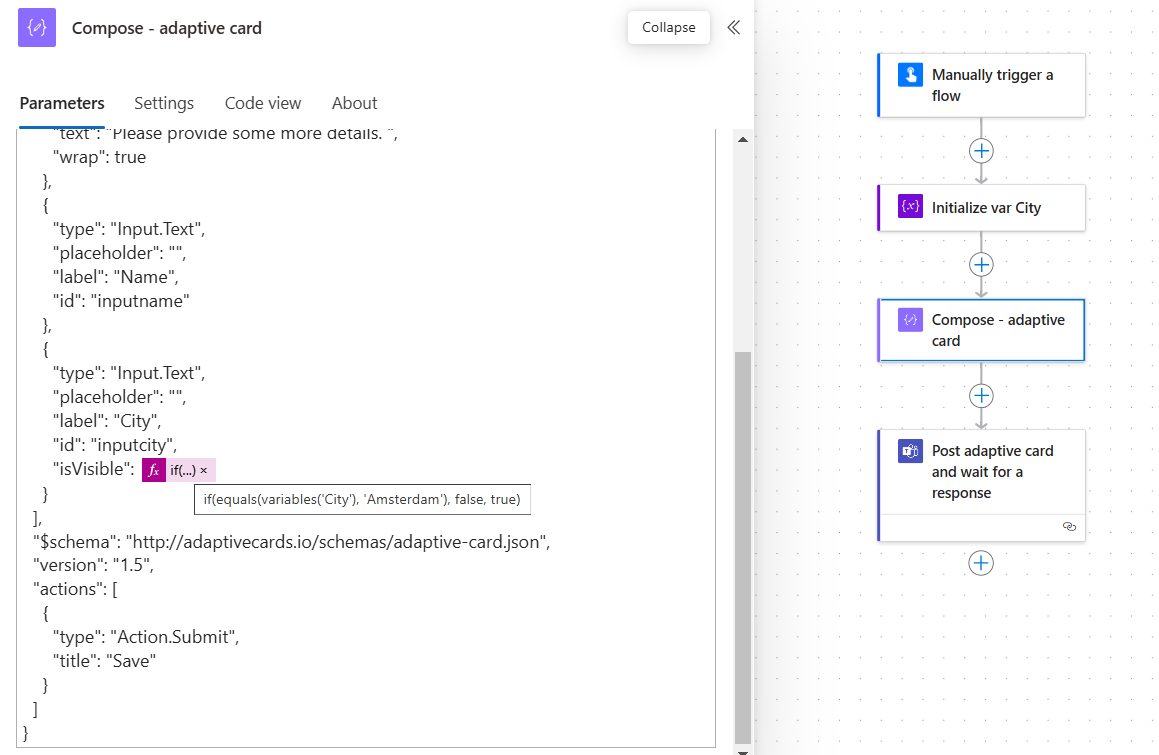
Compose action for building the adaptive card:
{
  "type": "AdaptiveCard",
  "body": [
    {
      "type": "TextBlock",
      "size": "Medium",
      "weight": "Bolder",
      "text": "Request for more information"
    },
    {
      "type": "TextBlock",
      "text": "Please provide some more details. ",
      "wrap": true
    },
    {
      "type": "Input.Text",
      "placeholder": "",
      "label": "Name",
      "id": "inputname"
    },
    {
      "type": "Input.Text",
      "placeholder": "",
      "label": "City",
      "id": "inputcity",
      "isVisible": @{if(equals(variables('City'), 'Amsterdam'), false, true)}
    }
  ],
  "$schema": "http://adaptivecards.io/schemas/adaptive-card.json",
  "version": "1.5",
  "actions": [
    {
      "type": "Action.Submit",
      "title": "Save"
    }
  ]
}
As you can see the ‘isVisible’ is an expression based on the value of the variable.
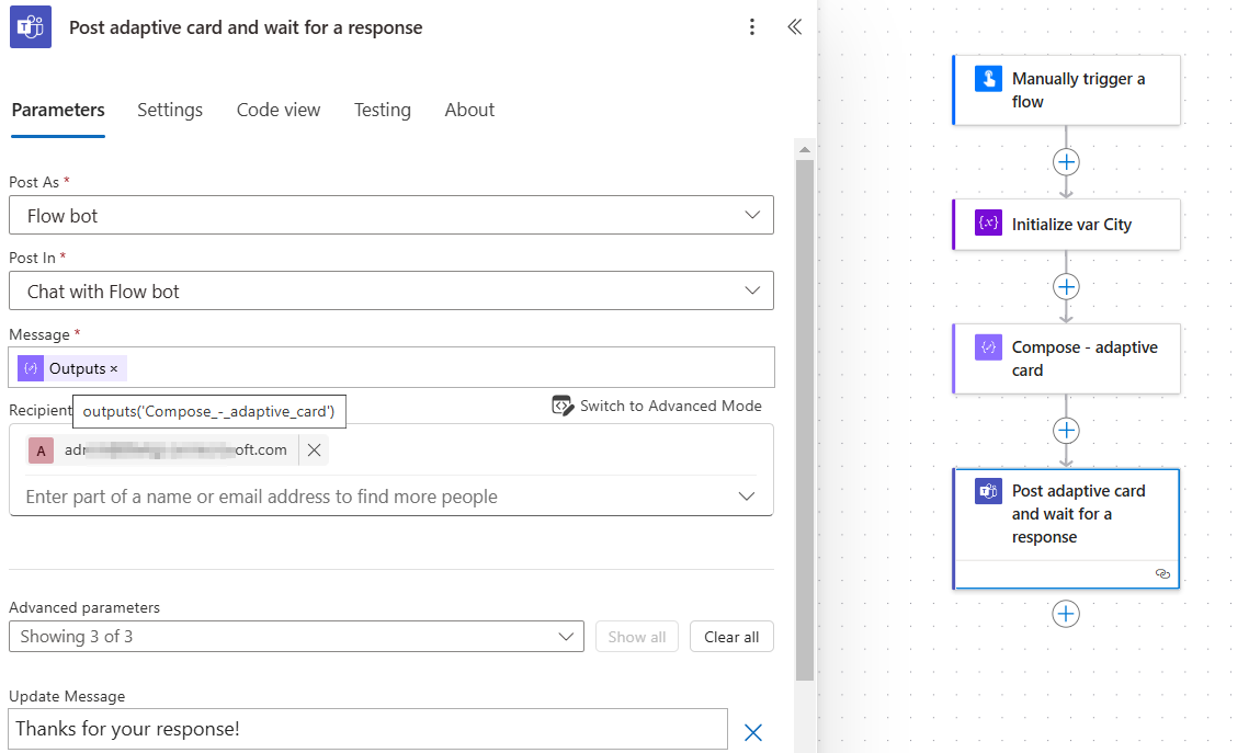
Post the card and you’ll see that’s is dynamically show or hide the city input!
Output
Here you see two versions of the same card.
In the first one, the city input field is visible because the value of the variable isn’t set to ‘Amsterdam’. It’s there, ready for the user to interact with. In the second version the city input is hidden, since the variable’s value is ‘Amsterdam’.
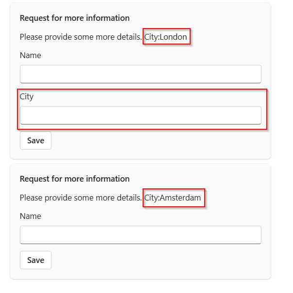
It’s a simple but effective example of how conditional visibility can be used to create dynamic, responsive cards that adjust based on specific conditions.

