Progress bar in Power Apps Canvas
Oct 25, 2024 • 5 • 1051
Table of contents
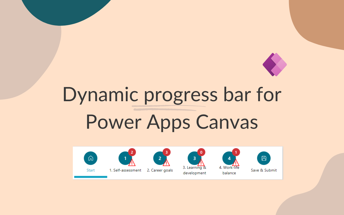
Having a good user experience is key, especially in app design. A nicely done progress bar in Power Apps can really boost this experience by giving users a clear and easy way to see their progress through various tasks. Whether they’re filling out forms, working through workflows, or going through multi-step procedures, a simple progress bar helps users know exactly where they are in the process.

What’s great about this progress bar is how it adjusts to fit the input table. This means you can customize the number of steps based on what the user needs and the data they’re working with, making sure the progress bar stays useful and relevant. Starting with a home icon at the beginning and ending with a save icon at the last step.
Structure
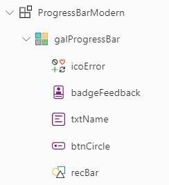
The example is designed as a component, but it can certainly be implemented directly within the app itself. The concept is based on one gallery with a couple of elements:

Component settings
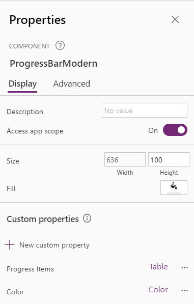
The component has a couple of settings:

| Property | Value |
|---|---|
| Width | CountRows(ProgressBarModern.ProgressItems) * 106 |
| Height | 100 |
The component contains two custom properties:
| Name | Type |
|---|---|
| Progress Items | Table |
| Color | Color |
Example content for the ‘Progress Items’
Table(
    {
        StepName: "Start",
        StepNo: 0,
        IsCurrent: true,
        hasError: 0
    },
    {
        StepName: "1. Self-assessment",
        StepNo: 1,
        IsCurrent: false,
        hasFeedback: 2,
        hasError: 1
    },
    {
        StepName: "2. Career goals",
        StepNo: 2,
        IsCurrent: false,
        hasFeedback: 3,
        hasError: 0
    },
    {
        StepName: "3. Learning & development",
        StepNo: 3,
        StepScreen: "Steps Screen",
        IsCurrent: false,
        hasFeedback: 0,
        hasError: 2
    },
    {
        StepName: "4. Work-life balance",
        StepNo: 4,
        IsCurrent: false,
        hasFeedback: 1,
        hasError: 0
    },
    {
        StepName: "Save & Submit",
        StepNo: 5,
        IsCurrent: false,
        hasError: 0
    }
)
Gallery settings
The properties set on Gallery level:
| Property | Value |
|---|---|
| Items | ProgressBarModern.ProgressItems |
| OnSelect | Set(varCurrentStep, LookUp(colSteps, IsCurrent = true).StepNo);Set(varStepToNavigate, ThisItem.StepNo); |
| Template size | 100 |
| Template padding | 5 |
icoError
⚠️ The icon for the warning isn’t visible by default. It depends on the ‘hasError’ value of the item.
The properties set on Gallery level:
| Property | Value |
|---|---|
| Visible | If(ThisItem.StepNo = 0 Or ThisItem.StepNo = Sum(galProgressBar.AllItemsCount - 1), false, If(ThisItem.hasError > 0, true, false)) |
| X | btnCircle.X + Self.Width + 5 |
| Y | btnCircle.Y + Self.Height |
| Width | 24 |
| Height | 24 |
badgeFeedback
The badge which is used as an indicator is only visible on an item where feedback is given. The properties to make this possible:
| Property | Value |
|---|---|
| Visible | If(ThisItem.StepNo = 0 Or ThisItem.StepNo = Sum(galProgressBar.AllItemsCount - 1), false, If(ThisItem.hasError > 0, true, false)) |
| Content | ThisItem.hasFeedback |
| X | btnCircle.X + Self.Width + 5 |
| Y | galProgressBar.Y |
| Appearance | ‘BadgeCanvas.Appearance’.Filled |
| Shape | “Circular” |
| Color | ‘BadgeCanvas.ThemeColor’.Danger |
txtName
The name of the step is displayed using the text with some basic properties.
| Property | Value |
|---|---|
| Text | ThisItem.StepName |
| Width | Parent.TemplateWidth |
| X | (Parent.TemplateWidth - Self.Width)/2 |
| Y | btnCircle.Y+btnCircle.Height |
| Weight | If(ThisItem.IsCurrent, FontWeight.Bold, FontWeight.Normal) |
btnCircle

The circular button serves three different visual variants. The first step always features a home icon, the last step displays a save icon, and the intermediate steps showcase the numerical value of each step—all represented by a single button element.
| Property | Value |
|---|---|
| Text | ThisItem.StepNo |
| Icon | If(ThisItem.StepNo =0, “Home”, If(ThisItem.StepNo = Sum(galProgressBar.AllItemsCount -1), “Save”, “”)) |
| Layout | If(ThisItem.StepNo = 0 Or ThisItem.StepNo = galProgressBar.AllItemsCount - 1, ‘ButtonCanvas.Layout’.IconOnly, ‘ButtonCanvas.Layout’.TextOnly) |
| X | (Parent.TemplateWidth - Self.Width)/2 |
| BasePaletteColor | ProgressBarModern.Color |
| BorderRadius / TopLeft, TopRight, BottomLeft, BottomRight | Self.Width /2 |
recBar
The rectangle is visible only below the current item, clearly indicating to the user which step is currently active.
| Property | Value |
|---|---|
| Visible | ThisItem.IsCurrent |
| Y | Parent.Height - 16 |
| Width | Parent.TemplateWidth |
| Height | 6 |
YAML
While writing this blog the YAML code view is still in preview and readonly. For future purpose, you can directly use the YAML code to easily copy/paste functionality. Therefore already the YAML code for this solution:
- ProgressBarModern:
    Control: Component
    Properties:
      Color: =RGBA(16,162,194, 1)
      ProgressItems: |-
        =Table(
            {
                StepName: "Start",
                StepNo: 0,
                IsCurrent: true,
                hasError: 0
            },
            {
                StepName: "1. Self-assessment",
                StepNo: 1,
                IsCurrent: false,
                hasFeedback: 2,
                hasError: 1
            },
            {
                StepName: "2. Career goals",
                StepNo: 2,
                IsCurrent: false,
                hasFeedback: 3,
                hasError: 0
            },
            {
                StepName: "3. Learning & development",
                StepNo: 3,
                StepScreen: "Steps Screen",
                IsCurrent: false,
                hasFeedback: 0,
                hasError: 2
            },
            {
                StepName: "4. Work-life balance",
                StepNo: 4,
                IsCurrent: false,
                hasFeedback: 1,
                hasError: 0
            },
            {
                StepName: "Save & Submit",
                StepNo: 5,
                IsCurrent: false,
                hasError: 0
            }
        )
      Height: =100
      Width: =CountRows(ProgressBarModern.ProgressItems) * 106
    Children:
    - galProgressBar:
        Control: Gallery
        Variant: BrowseLayout_Horizontal_TwoTextOneImageVariant_ver5.0
        Properties:
          OnSelect: |+
            =Set(varCurrentStep, LookUp(colSteps, IsCurrent = true).StepNo);
            Set(varStepToNavigate, ThisItem.StepNo);


          AccessibleLabel: ="Progress"
          Items: =ProgressBarModern.ProgressItems
          BorderColor: =
          BorderStyle: =BorderStyle.None
          DelayItemLoading: =true
          FocusedBorderColor: =
          FocusedBorderThickness: =0.1
          Height: =Parent.Height
          TabIndex: =0
          TemplateSize: =100
          Width: =Parent.Width
        Children:
        - icoError:
            Control: Classic/Icon
            Variant: Error
            Properties:
              OnSelect: =Select(Parent)
              Tooltip: =
              BorderColor: =RGBA(0, 18, 107, 1)
              Color: =RGBA(255, 0, 0, 1)
              Height: =24
              Icon: =Icon.Warning
              Visible: =If(ThisItem.StepNo = 0 || ThisItem.StepNo = Sum(galProgressBar.AllItemsCount - 1), false, If(ThisItem.hasError > 0, true, false))
              Width: =24
              X: =btnCircle.X + Self.Width + 5
              Y: =btnCircle.Y + Self.Height
        - badgeFeedback:
            Control: Badge
            Properties:
              AccessibleLabel: ="Review badge"
              Appearance: ='BadgeCanvas.Appearance'.Filled
              Content: =ThisItem.hasFeedback
              ThemeColor: ='BadgeCanvas.ThemeColor'.Danger
              Height: =24
              Visible: |-
                =If(ThisItem.StepNo = 0 || ThisItem.StepNo = Sum(galProgressBar.AllItemsCount - 1), false, true)

                //If(ThisItem.hasFeedback > 0, true,false)
              Width: =24
              X: =btnCircle.X + Self.Width + 5
              Y: =galProgressBar.Y
        - txtName:
            Control: Text
            Properties:
              Align: ='TextCanvas.Align'.Center
              Font: =Font.'Segoe UI'
              FontColor: =If(ThisItem.IsCurrent, RGBA(16,162,194, 1), RGBA(0, 0, 0, 1))
              Size: =12
              Text: =ThisItem.StepName
              Weight: =If(ThisItem.IsCurrent, FontWeight.Bold, FontWeight.Normal)
              Height: =36
              Width: =Parent.TemplateWidth
              X: =(Parent.TemplateWidth - Self.Width)/2
              Y: =btnCircle.Y+btnCircle.Height
        - btnCircle:
            Control: Button
            Properties:
              OnSelect: =Select(Parent)
              BasePaletteColor: =ProgressBarModern.Color
              BorderRadiusBottomLeft: =Self.Width /2
              BorderRadiusBottomRight: =Self.Width /2
              BorderRadiusTopLeft: =Self.Width /2
              BorderRadiusTopRight: =Self.Width /2
              BorderStyle: =BorderStyle.None
              Icon: =If(ThisItem.StepNo =0, "Home", If(ThisItem.StepNo = Sum(galProgressBar.AllItemsCount -1), "Save", ""))
              Layout: |+
                =If(
                    ThisItem.StepNo = 0 || ThisItem.StepNo = galProgressBar.AllItemsCount - 1,
                    'ButtonCanvas.Layout'.IconOnly,
                    'ButtonCanvas.Layout'.TextOnly
                )
              Text: =ThisItem.StepNo
              Height: =41
              Width: =41
              X: =(Parent.TemplateWidth - Self.Width)/2
              Y: =10
        - recBar:
            Control: Rectangle
            Properties:
              OnSelect: =Select(Parent)
              BorderColor: =RGBA(0, 18, 107, 1)
              Fill: =ProgressBarModern.Color
              Height: =6
              Visible: =ThisItem.IsCurrent
              Width: =Parent.TemplateWidth
              Y: =Parent.Height - 16
    AccessAppScope: true
    CustomProperties:
    - ProgressItems:
        Direction: Input
        PropertyType: Data
        DataType: Table
        IsResettable: true
        DisplayName: Progress Items
        Description: The example input for the gallery
    - Color:
        Direction: Input
        PropertyType: Data
        DataType: Color
        IsResettable: false
        DisplayName: Color
        Description: Color used for the button and rectangle
Wrap-up
As we finish up our dive into making a dynamic progress bar in Power Apps, it’s clear that you can really improve user experience with smart design choices. Adding visual stuff like circular buttons and clear icons helps users smoothly go through their tasks, making everything more intuitive and fun.

