Part 3: Enhancing User Engagement Measurement on SharePoint Intranets: Visualize data
Oct 21, 2023 • 2 • 305
Table of contents
Measuring user engagement is crucial for any SharePoint-based intranet to ensure that the platform is meeting its intended purpose and delivering value to the users. You can already benefit from Viva Connections and Viva Insights to enhance the user engagement measurement capabilities.
In the first part of this blog serie , you could read how to use the Power Platform to measure user engagement even more deeply using KPI regarding user engagement.
In part 2 the KPI regarding page freshness was covered.
In this third and last part we will cover how to visualize the collected data in Power BI to gain insights into user behavior and engagement patterns. We will walk through the creation of a dashboard that displays the engagement metrics in a clear and concise manner, allowing intranet administrators to quickly assess the intranet’s effectiveness and identify areas for improvement.
Set up the report
The data in the SharePoint lists can now be used to create statistics in Power BI, so data can be analyzed over a longer period of time.
Get the data into PowerBI and set the data type to the columns which contains numbers to ‘Whole number’. Unfortunately PowerBI don’t detect this automatically, although you set those columns as numbers in SharePoint.

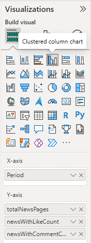
Select the clustered column chart as visualization and set X-axis and Y-axis values.

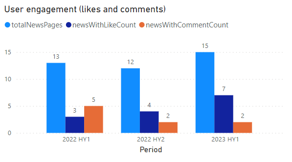
The end result is a graphic in which you can see the user engagement based on likes and comments.

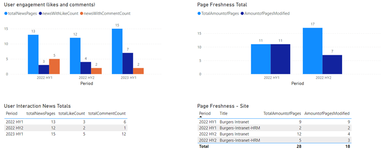
Create some more graphics for some more details to get toe total Like and total Comment count and add the page freshness data.

The dashboard is ready and engagement metrics are set in a clear and concise manner, allowing intranet administrators to quickly assess the intranet’s effectiveness and identify areas for improvement.
Extending idea
- Idea to extend dashboard with title of most liked news article

